Main Gameplay Area
It was decided early on in the process that we would try to maintain single main world level and introduce scene changes should we need to load another area or an enclosed section of the world e.g. a cutscene or event area.
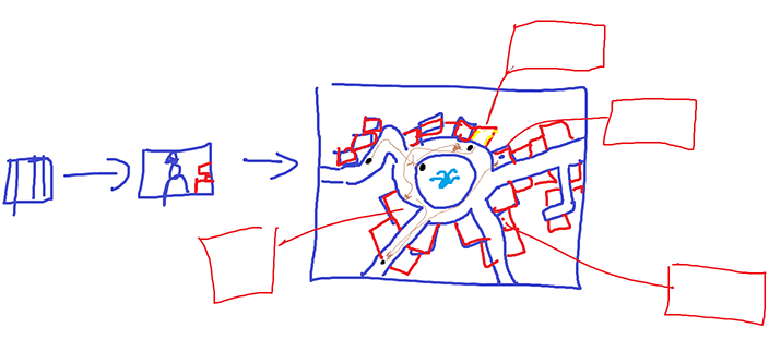
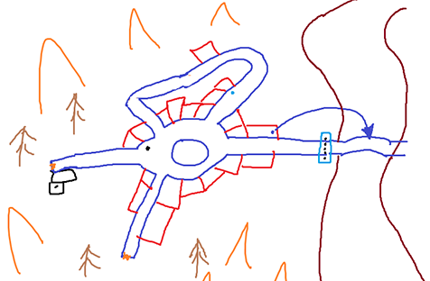
My first designs were simple sketches created so I could easily relay ideas to the team. They contain minimal detail, but do include player movement paths, event call-outs and ideas for scene transitions. Examples below.


Later, once I had some assets in the engine, most of my level design was through iteration in-engine. During meetings when I may not have the ability to rapidly change something, its necessary to take notes on design changes. During the semester I've started to work with design notes outside of the engine more, and I've found that a quick print screen and stylus is one of the best tools for fast iteration of ideas involving level design.
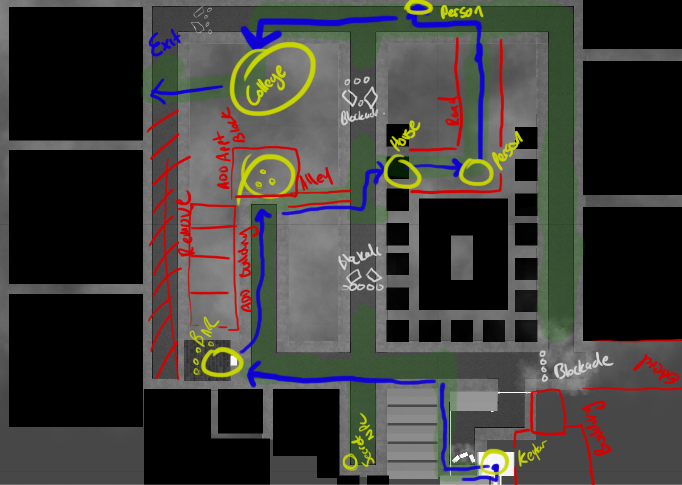
Below you can see a sketch of some design ideas.
- Blue lines trace the players path through the level.
- Yellow are encounter points in the story.
- Green shading is the explorable/walkable area.
- White is police/guard presences
- Red indicates a modification to the level geometry.

Design Choices
I've designed the main level with some specific ideas in mind.
Claustrophobia
Even though the area is sizeable and open, I've tried to design it to feel claustrophobic. The buildings that surround the main area are tall and imposing, obscuring most of the skyline. The lighting and render settings have been tweaked to keep the scene quite dark and limit vision. All of the streets/alleys are straight, either very long or very short, and every corner is a right angle. All of this is intended to limit vision, make the player feel like they are boxed in, or in a tunnel and can't escape.
Atmosphere
Much of the area is intended to feel sterile and cold, almost all of the terrain is flat geometry with unblemished metallic materials. Roads and pavements have some specularity to give a damp/icy cold feel.
Once filled with colour the environment feels much warmer and rich, the lighting plays an important role in this, by using many different vibrant colours the environment feels more dynamic and alive.
Unwelcoming
The grayscale environment is an unwelcoming place that offers no "real" affordances as defined by Cardona-Rivera and Young[1]. The world has many "perceived" affordances but in the grayscale world they are not strictly advertised nor interactable. Only when the area is in colour is an object able to be interacted with. This creates a sort of cognitive dissonance where the players perceived affordances only align with real affordances within the saturated areas. The idea is that this dissonance provokes a negative response and makes the player feel unwelcome in the grayscale areas.
Cardona-Rivera, R. E., & Young, R. M. (2013). A Cognitivist Theory of Affordances for Games. In DiGRA Conference. Retrieved from http://www.digra.org/wp-content/uploads/digital-library/paper_74.pdf ↩︎